Exclusive Black Friday offers available in store from November 22nd to 27th

The best flamingo colors for a decoration between winter and spring

Summary

As winter slowly fades away and spring begins to show its presence, it's time to adapt your interior to this period of transition. The Flemish style, renowned for its timeless elegance and natural sobriety, lends itself perfectly to this exercise. It allows you to integrate soft and balanced colors, creating an atmosphere that is both warm and bright.

But what are the best flamingo colors to make the link between winter and spring? How to adapt the color palette of your interior without losing elegance and coherence? Discover the essential shades to be preferred for a harmonious and refined decoration.

Why adapt your color palette between two seasons?

Winter is often marked by deep and enveloping hues, while spring brings a desire for freshness and clarity. It is therefore essential to find a subtle balance between these two atmospheres.

  • Avoiding a breakup that is too abrupt : Radically changing the decoration can give an impression of incoherence. It is better to integrate transitional colors for a natural evolution.
  • Bring more light : As winter comes to an end, it is important to favor shades that reflect natural light.
  • Keeping the warmth of the flamingo style : Even with the arrival of sunny days, softness and comfort remain essential elements of the Flemish style.

The essential colors of the flamingo style at the end of winter

Neutral and timeless tones: a bright and elegant base

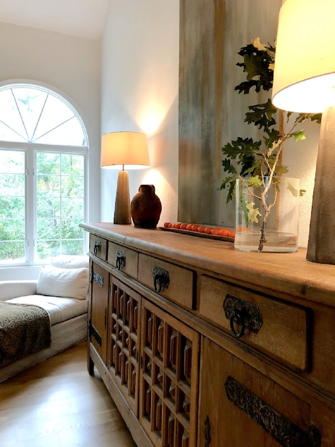
Neutral colors are the signature of the Flemish style. They serve as ideal base to create a bright and soothing atmosphere, while facilitating associations with other more marked shades.

  • Off-white and ecru : These slightly warm shades are perfect for brightening up an interior without making it cold. They are ideal for walls, textiles and weathered wood furniture.
  • Sand beige and natural linen : Soft shades that bring a subtle warmth, perfect for maintaining the cozy spirit of winter while lightening the decoration.
  • Pearl gray and light taupe : These shades help to create a refined and elegant atmosphere, serving as perfect transition between winter and spring.

How to integrate them?

  • Use these colors to walls, curtains and large pieces of furniture.
  • Pair them with natural materials like raw wood, linen or stone for an even more authentic rendering.

Pastel shades: a touch of subtle freshness

As the days get longer, it's nice to introduce lighter and airier shades while remaining faithful to the sobriety of the Flemish style. Pastels are perfect for soften the transition between two seasons.

  • Sage green and light olive green : Inspired by nature, these tones bring a feeling of freshness and balance, perfect for announcing spring without overdoing it.
  • Blue gray and smoky blue : Ideal for adding a soothing and elegant note to decoration. This color works particularly well on cushions, bed linen or wall accessories.
  • Powder pink and pale terracotta : Warm but subtle shades, which give a touch of softness without falling into an overly marked style.

How to integrate them?

  • In small touches, on cushions, ceramic vases, linen blankets or decorative objects.
  • Combined with the neutral colors mentioned above, to avoid an overly colorful effect.

Deep and natural colors: maintain a cozy atmosphere

Even if you want to lighten the decoration, some deeper shades can be kept in small doses to structure the space and maintain a feeling of comfort.

  • Cognac brown and smoked wood : These warm shades bring character and relief, particularly to solid wood furniture or aged leather seats.
  • Anthracite and charcoal gray : Used in small touches (frames, lighting, textiles), they create a subtle and elegant contrast.
  • Bordeaux or dark ochre : Combined with lighter shades, these tones add a sophisticated and warm note.

How to integrate them?

  • With patinated metal accessories, lamps, wall frames or light velvet armchairs.
  • In dosing sparingly to avoid darkening the room.

How to harmonize these colors for a smooth transition?

Achieving a balanced flamingo decoration at the end of winter is based on the correct distribution of colors in every room.

In the living room: brightness and softness

  • Neutral base : A wall in sand beige or pearl gray.
  • Pastel touches : Sage green and smoky blue cushions on a natural linen sofa.
  • Structuring elements : A jute rug, ecru ceramic vases and a black metal floor lamp.

In the bedroom: warmth and serenity

  • Walls and bed linen in light shades (off-white, natural linen).
  • Sage green waffle cotton blanket and powder pink cushions for a soft contrast.
  • Bedside table or headboard in weathered wood for a touch of authenticity.

In the entrance: a welcoming and bright space

  • Light gray or linen beige paint on the walls to maximize light.
  • Mirror framed in aged wood to enlarge the space.
  • Small accessories in black metal and white ceramic to structure the decoration.

Create a balanced and harmonious atmosphere

THE flamingo style is based on a subtle blend of natural shades, soft nuances and well-balanced contrasts. By adapting your decoration to the end of winter, you can maintain a cozy atmosphere while bringing a touch of freshness and renewal.

  • Opt for a bright neutral base to soften the ambiance and maximize clarity.
  • Add pastel shades for a natural and elegant transition.
  • Keep some touches of deep colors to structure the space without weighing it down.

With these tips and inspirations, your Flemish interior will be perfectly balanced between comfort and lightness, ready to welcome the beautiful days in all elegance.

Want to find out more?

Visit our store located at 7 Route De Villiers, 77780 Bourron Marlotte for an immersive experience.

Explore now and let yourself be inspired!

en_US