Private sales in store from 26/12/25 to 06/01/26!
Spring is the season of renewal, and with it comes the desire to refresh your interior by playing on a palette of brighter and lighter colors. The flamingo style, characterized by its timeless elegance and natural hues, adapts perfectly to this seasonal transition. By combining colors wisely, it is possible to bring freshness, light and softness while retaining the authenticity and warmth of the Flemish style.
Discover the ideal color combinations for a spring decoration that combines charm and sobriety.
THE flamingo style is based on a color palette natural and soothing, which serve as a basis for creating a soft and refined atmosphere.
💡 Decorating tip : These neutral shades can be used for walls, large furniture and textiles (curtains, rugs, sofas), thus serving as a backdrop for more dynamic touches of color.

With the arrival of fine weather, it is interesting to introduce pastel and natural colors, which recall nature and instill a feeling of freshness.
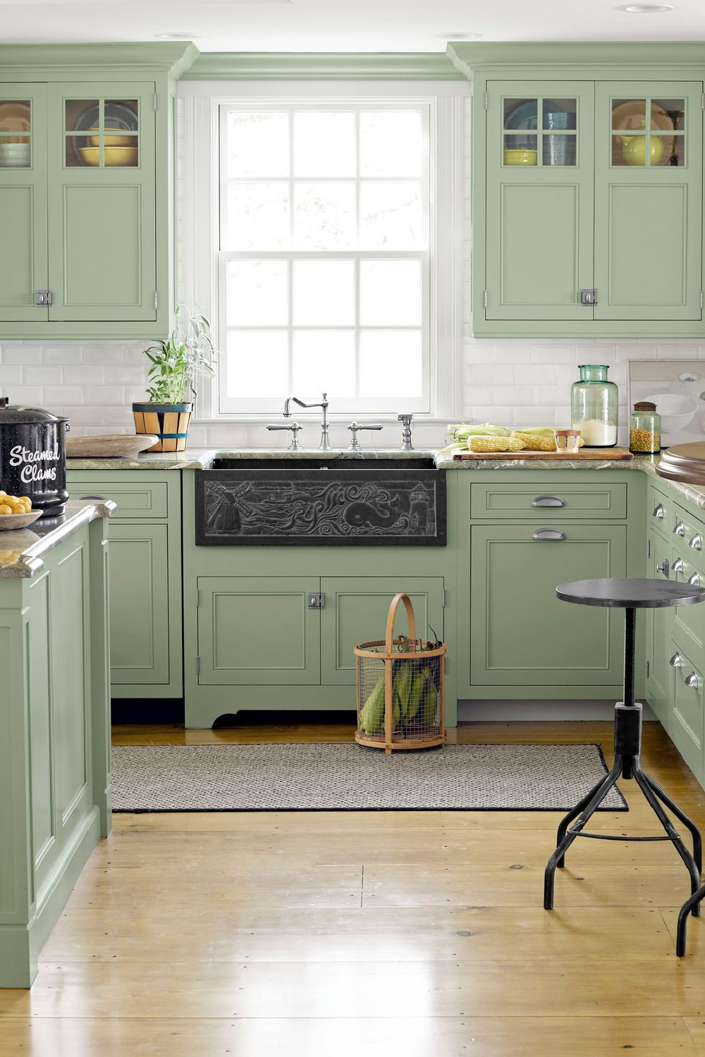
THE sage green, soft and soothing, is a perfect shade for spring decoration. Associated with beige linen, it creates a natural and balanced atmosphere.
✅ Where to integrate it?
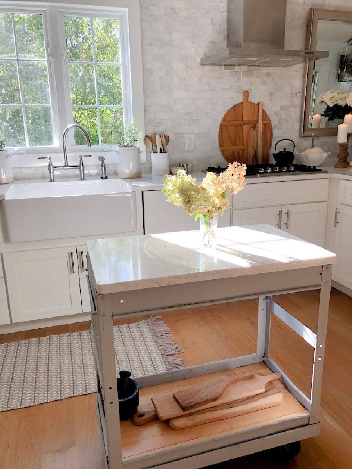
THE blue gray, slightly powdery, is a color that brings a touch of freshness while remaining subtle. Associated with off-white, it gives a clean and bright look, perfect for Flemish-style interiors.
✅ Where to integrate it?
THE powder pink, delicate and refined, goes perfectly with light taupe or beige tones. This combination brings a feeling of comfort and warmth, without falling into an overly feminine decoration.
✅ Where to integrate it?
THE spring evokes nature, and what better way than to integrate shades inspired by the environment for a fresh and lively interior?
THE olive green, slightly deeper than sage green, brings a Mediterranean touch while remaining understated. Combined with light wood, it creates an atmosphere warm and authentic.
✅ Where to integrate it?
THE pale yellow, used in small touches, energizes an interior without being too intrusive. Associated with pearl gray, it brings a subtle balance between warmth and modernity.
✅ Where to integrate it?

THE flamingo style being based on natural textures, it is essential to combine well colors and materials for a harmonious effect.
💡 Decorating tip : Associate light wood furniture with linen and ceramic accessories for a result that is both fresh and authentic.
Succeed in your spring decoration in flamingo style, it is above all knowing balance the colors, the textures And natural materials to create a elegant and warm atmosphere.
✔ Use neutral shades (off-white, beige, light taupe) as a light base.
✔ Focus on soft colors (sage green, gray blue, powder pink) for an elegant spring touch.
✔ Combine natural colors (olive green, light wood, pale yellow) for a fresh and lively effect.
✔ Playing with materials (linen, wood, ceramic, blown glass) for a harmonious and refined result.
By applying these principles, your flamingo interior will take on springtime looks while maintaining its timeless and sophisticated charm. 🌿✨
Want to find out more?
Visit our store located at 7 Route De Villiers, 77780 Bourron Marlotte for an immersive experience.
Explore now and let yourself be inspired!