Private sales in store from 26/12/25 to 06/01/26!
Just in case you were wondering, this paint color consultant and blogger isn't going to rank a bunch of colors. The question we're addressing here is about the selection process to sample the best white suitors for your needs .
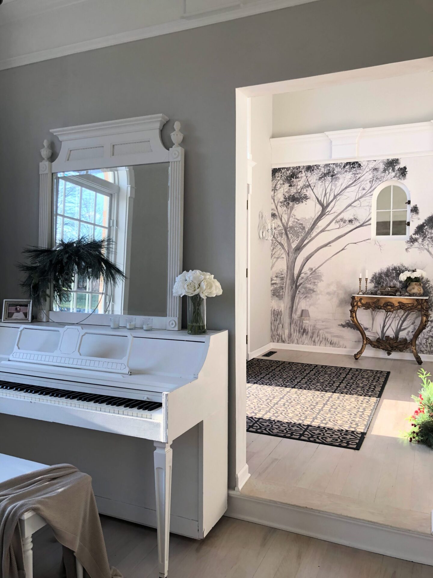
Whether you're getting ready to paint walls, trim, ceilings, doors, windows, or cabinets, help is on the way. Because chances are, you've got a living room, bedroom, bathroom, or kitchen that could use a white paint job.
To choose the BEST WHITE, don't get obsessed with a single color you see in a picture or on Pinterest and assume it will be perfect without trying a sample. Why?
First, professional photography often involves editing. Second, the location and lighting of the room probably vary considerably from yours.
Third, sometimes the sound of a particular paint color will charm you and the name doesn't matter. (Psst. A lot of white paint colors don't even have white in their name!
Start with a handful of tones to sample on your walls. From there, you'll narrow your search to the white paint that's right for you.
The most important factor in choosing the perfect white for your project is sampling several competitors. You need a few options to try in your unique environment.
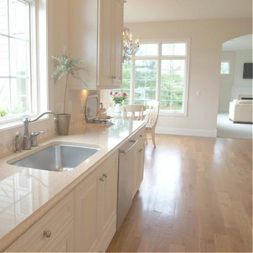
White colors have undertones that aren’t always easily detectable. It’s only when you have swatches (definitely use Samplize for a mess-free solution instead of all those useless paint cans) side by side that you start to see how whites vary. Here’s a cool, bright white with blue undertones:
Or with an off-white with pink/magenta nuances:
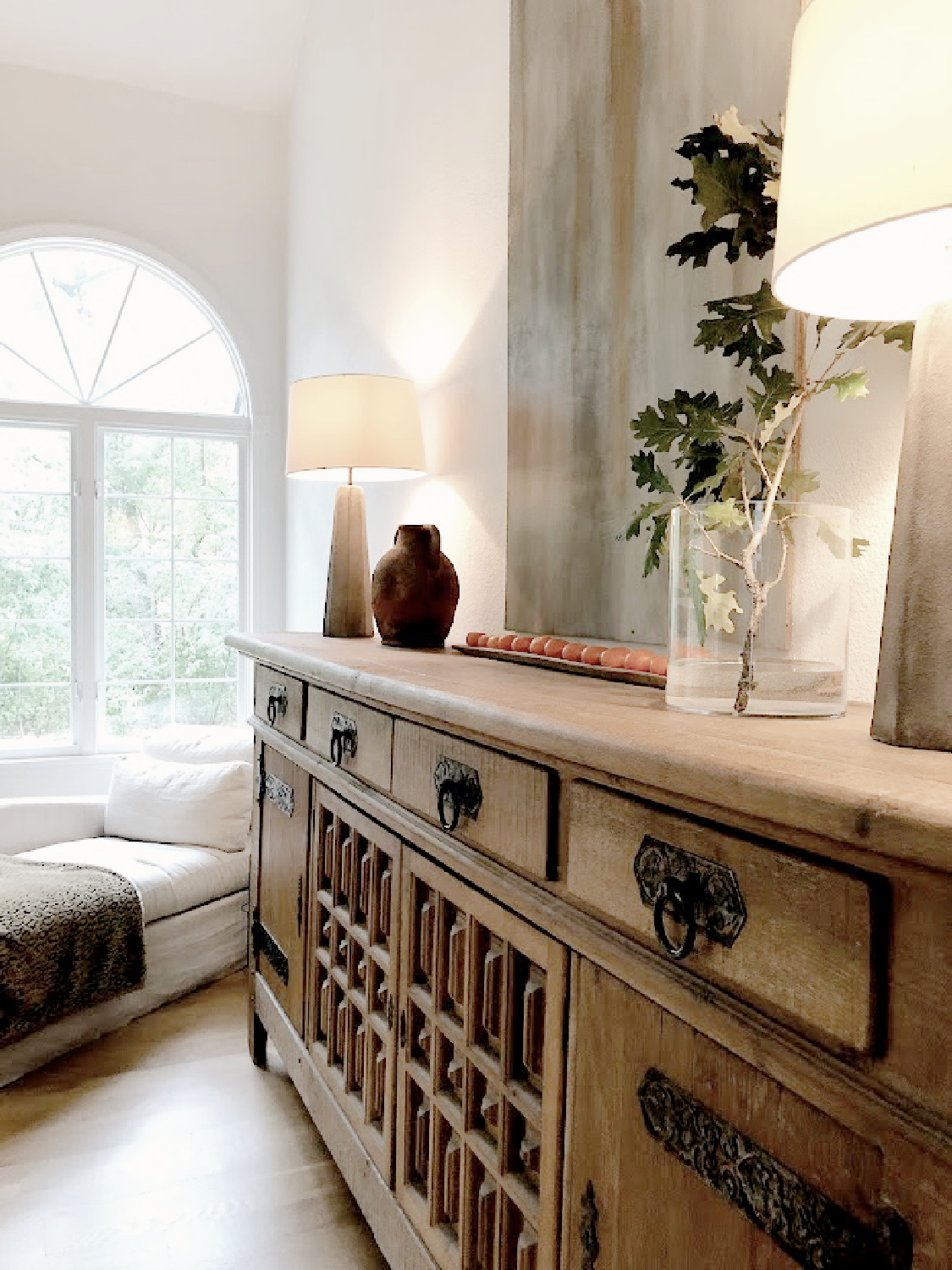
Or also a warm white with green and brown undertones in a kitchen:
ONLINE IMAGES & LIGHTING
There's also the issue of how the light in your room interacts with the color. When you view an image online, it may reflect a washed-out version of the paint color due to abundant natural light.
Or maybe it's a dark space that creates the perception of a less bright white. In any case, you need to see what a painting looks like with your lighting.
If you've ever stood in a big box store under fluorescent lights looking at a million little paint swatches...then you know. It's frustrating and fruitless for the most part.
In addition to lighting, different whites will have different temperatures depending on the nuances added to the pure white.
It's not always obvious or easy to detect whether a white will be too cool or too warm just by looking at a small sample or seeing a few images online.
Cool whites have blue, gray, or black undertones and give off a different vibe than warm, creamy whites with brown or green undertones.
The temperature of the white will be influenced by the lighting in your space.
If you are repainting your living room, does the space receive plenty of natural light? Is there a lot of artificial light?
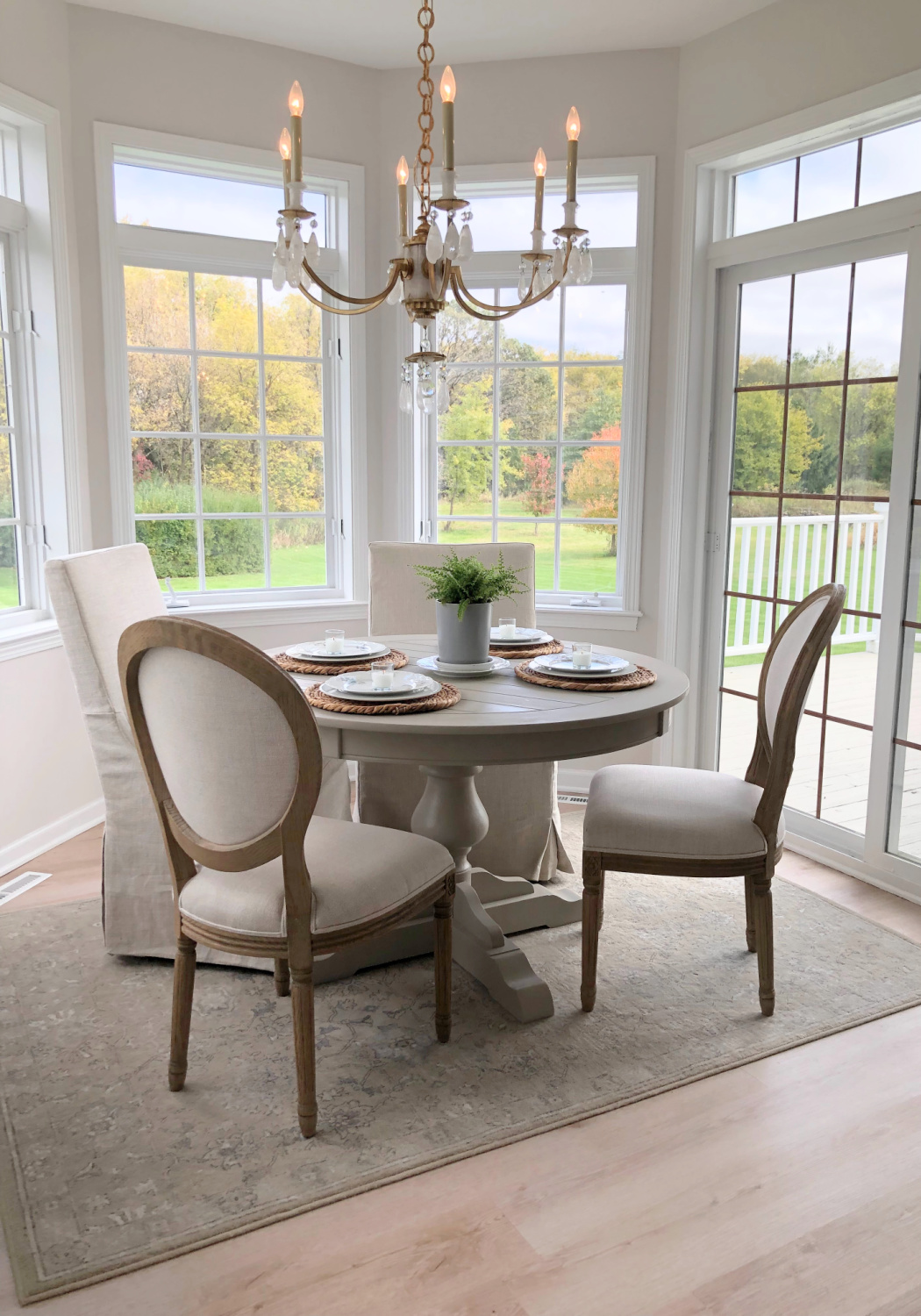
Sunlight will interact with white and affect its perception. The room's exposure will also be a factor. For example, if you're painting a kitchen that you use primarily in daylight, you'll want to pay special attention to how the sample will look in that space during the day. If the kitchen faces east, the same white that looks perfect in that exposure might look too dark in a north-facing space because it is probably darker.
There are of course no hard and fast rules, because sometimes the goal is to create a moody atmosphere (or a subdued atmosphere for a bedroom, office, family room or living room).
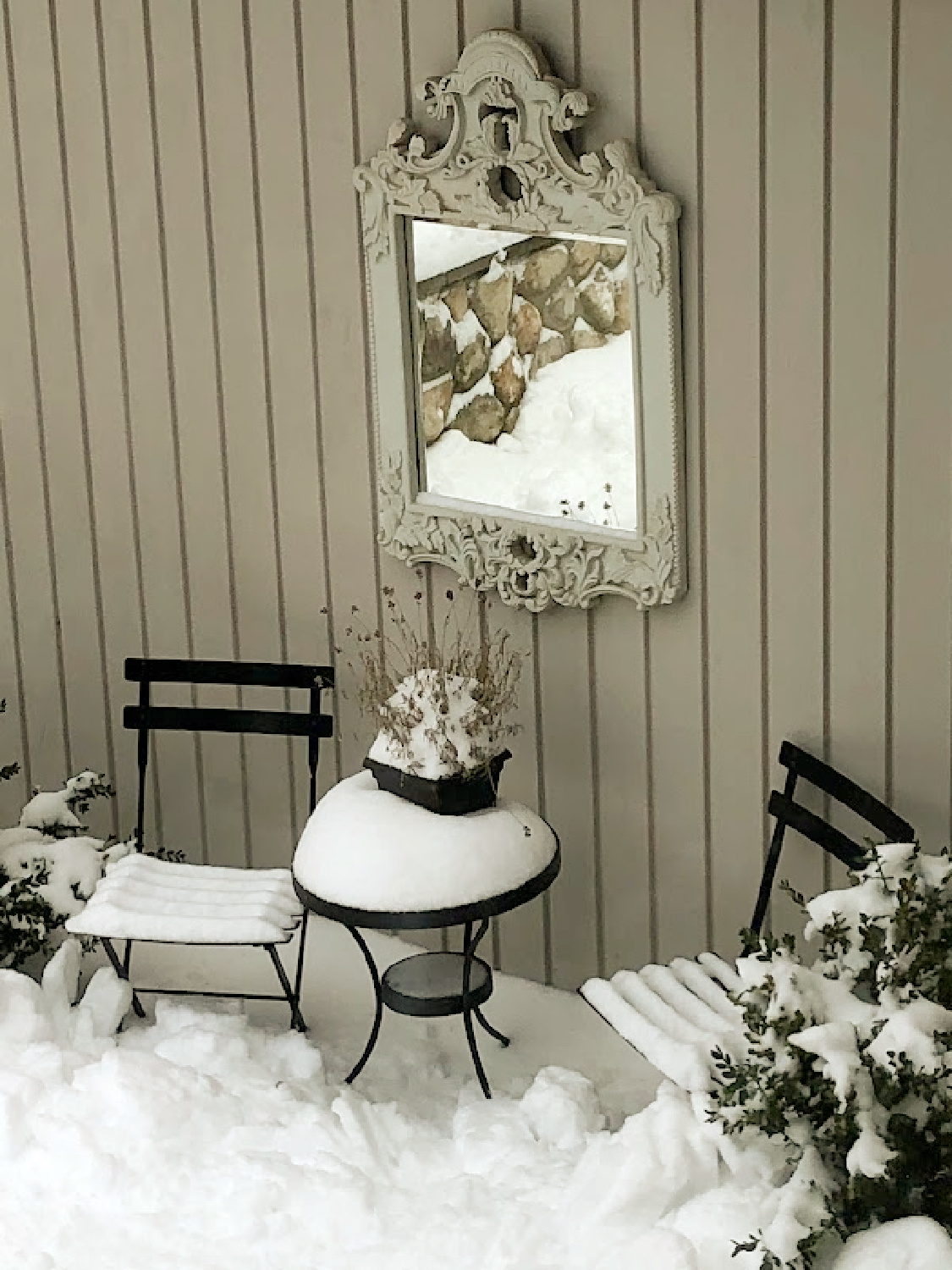
If you live in the north, where the light is totally different than in the southwest, white paint colors take on a completely different quality here because of the light.
The amount of light reflected back into space varies with each white color. LRV simply tells us how bright and clear or moody and dark the color is. The LRV for OC-151 (below) is 83.56.
This means that 83.56 % of the light will be reflected back into the room. This number represents reflectivity, so an LRV of 100 corresponds to the brightest white possible and 0 to the darkest black.
If you choose a white exterior color, in most cases you won't want a pure white with too high a LRV. Anything with an LRV above 80 may be too bright since natural light will shine on it outside.
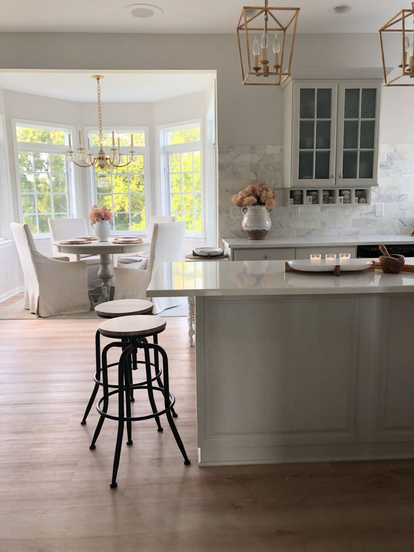
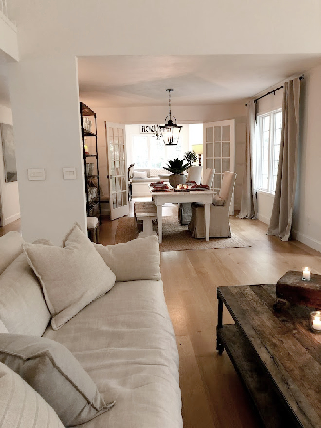
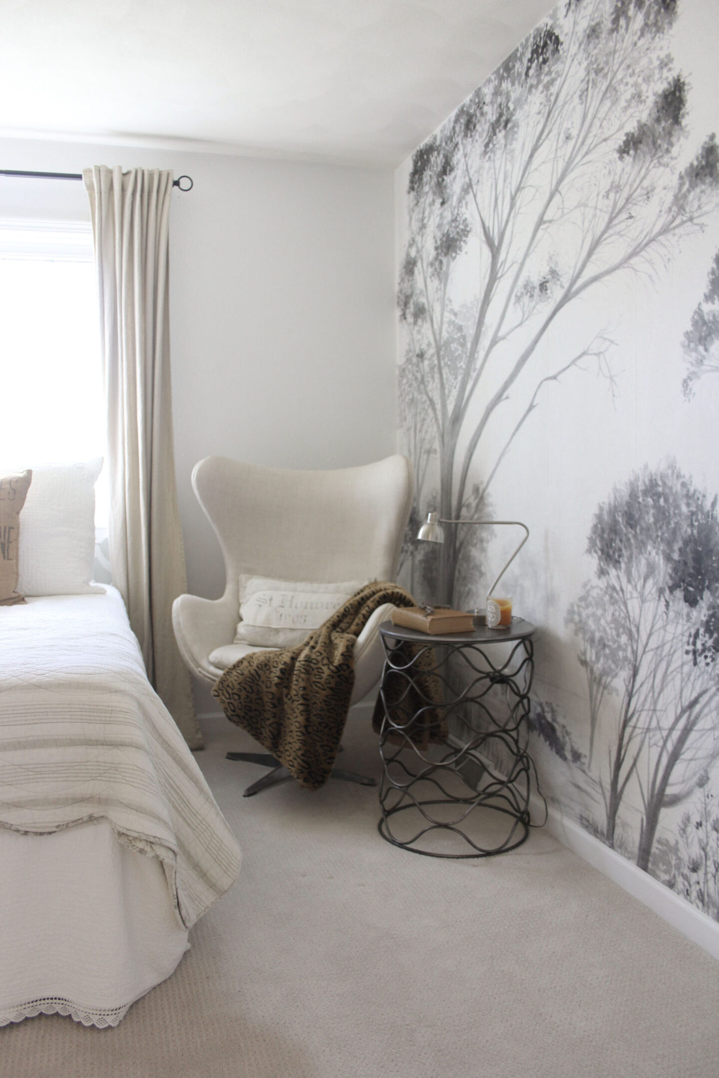
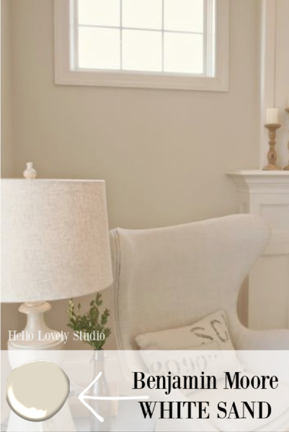
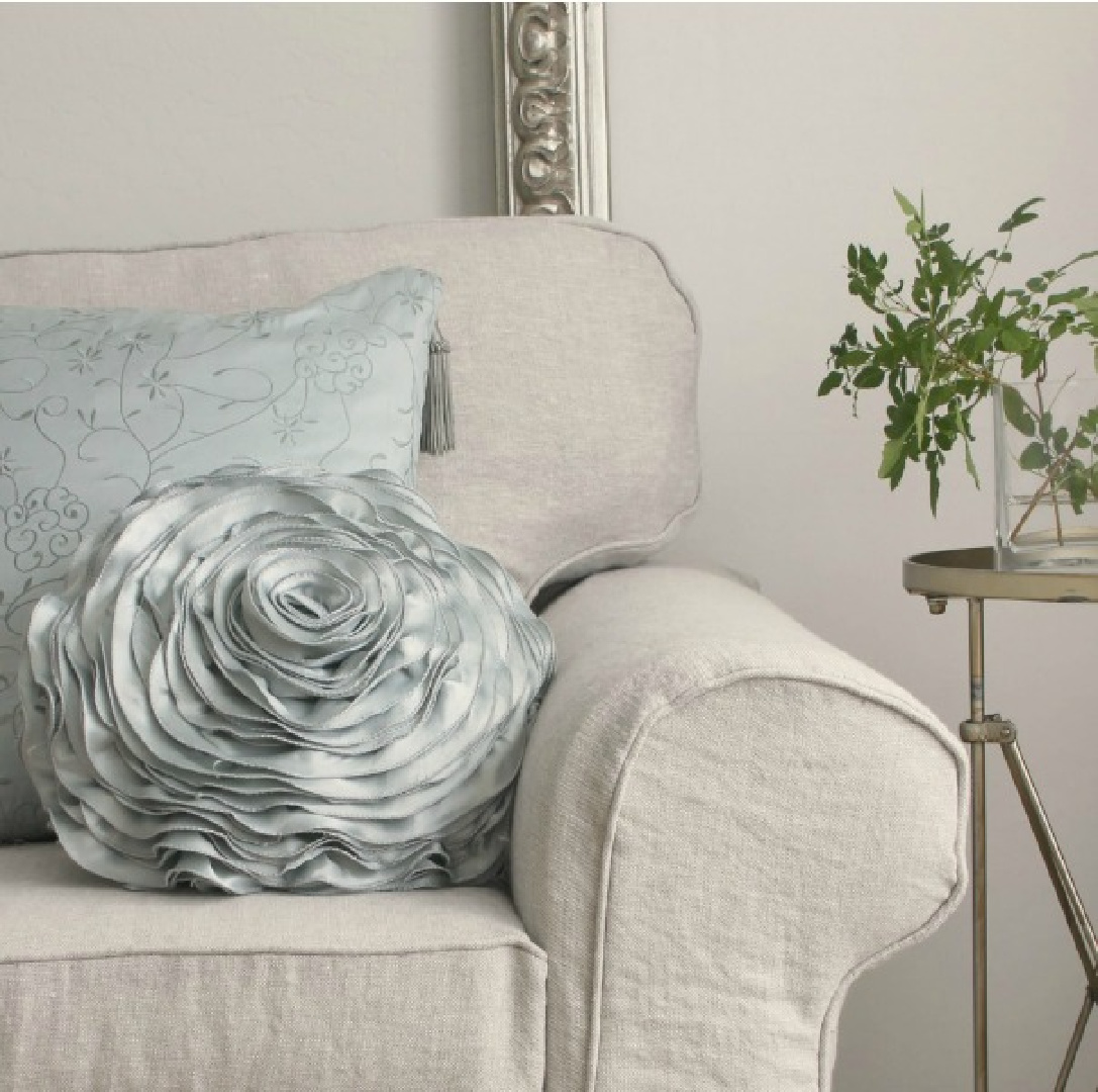
The right white should make sense when paired with other design elements in the room (furniture, molding, artwork, lighting, hardware). If your furniture is in warm earth tones, in most cases you'll stick with whites with warm or neutral undertones.
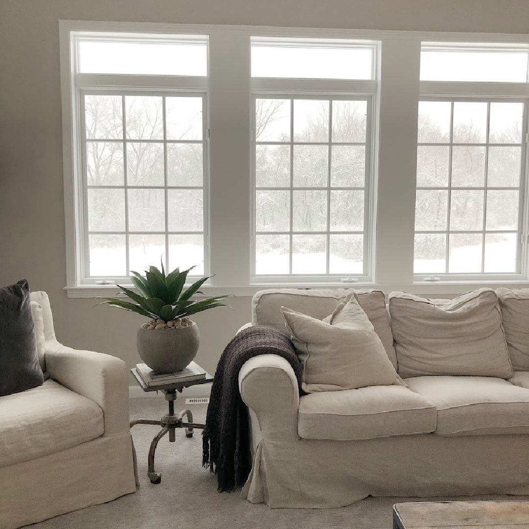
The upholstery is a neutral linen color and the neutral gray walls provide a cozy tone-on-tone look. Notice the effect of Belgian linen upholstery with cool white walls with higher LRV and more contrast:
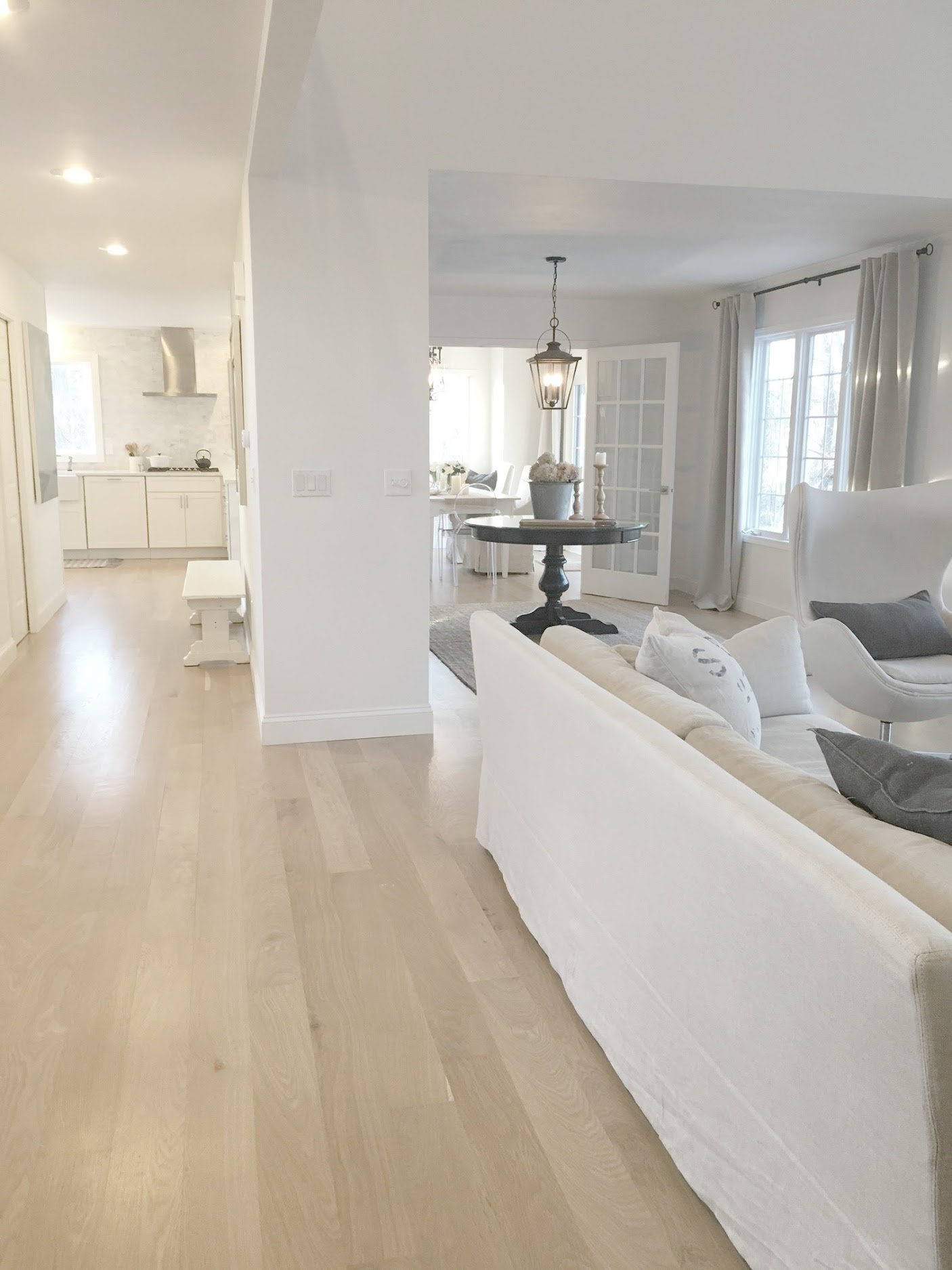
It's no wonder so many people choose neutral-toned furniture, which allows for versatility when it comes to interior wall color and crown molding trim color. Knowing whether you're looking for low contrast (like monochromatic or toned schemes), high contrast (like black and white), or somewhere in between will guide you.
There are cool, crisp whites, off-whites, creamy whites, warm whites, gray-whites, ecru, putty, beige, greige, and it's sort of endless.
Fortunately, there are plenty of neutral whites available. Not too cool, not too hot, and somewhere in the middle. These neutrals can even look like chameleons; in some contexts they may appear colder or warmer than in others.
Your perception of color is ultimately what will help you find the perfect white paint for your walls, trim, or siding. We all perceive colors and shades a little differently. For example, as we age, we see more yellow. (So depending on your age, White Dove, above, might look creamier and a little antique white in your space.)
Some people are more sensitive to detecting undertones while others have difficulty distinguishing the subtle qualities of neutrals beyond “too light” or “too dark.” You will need to decide whether it makes sense to go for a shiny, warm, cool or creamy result.
And it's okay if this part of the process takes a little while...it'll start to make sense once you start sampling and noticing the nuances, temperatures, and tones you don't like.
Even if you've sampled a handful of different shades of warm white or a dozen shades of beige, the white may not look quite right once the walls are painted.
Sometimes an initial mistake ultimately leads to the right choice. A small section of painted wall or a peel-and-stick sample simply doesn't provide as much data as an entire wall or multiple walls covered in paint.
OTHER QUESTIONS THAT MAY ARISE
How many samples should I try? A minimum of three, but five seems to be the sweet spot to view them all at once. It's possible that none of the samples look right. You can always start the process over. But seeing a dozen Whites together at once gets confusing.
Can I paint my woodwork the same color as the walls? Yes. Sometimes it makes sense when you don't want to emphasize trim. It also makes sense when you want a calmer or more sedate look where the eye doesn't stop at the contrasting spots around windows, ceilings, or flooring.
Finally, even if a space has beautiful millwork and architectural details that you love, you can always choose to keep the same color on the walls and trim for a serene effect. As you browse through images of stunning interior designs on this blog, notice the contrast between walls, doors, windows and doors. Are you drawn to more contrasting looks or less contrasting combinations?
Are some white paint colors more reliable than others? Some colors become very popular because they seem exceptionally versatile. We usually know them because interior designers who work on many projects may have a few favorites. These designer favorites tend to be neutrals or chameleons in the sense that they sometimes read warm and sometimes cool and work in a variety of lighting situations in one way or another. Benjamin Moore Simply White and White Dove, Sherwin-Williams Alabaster and Pure White, and Farrow & Ball All White are five popular designer colors that you might consider sampling.
Is it acceptable that the white I have chosen for all the interiors is different from one room to another? In almost all situations, yes.
But it also depends. Some interior designers alter the saturation of a color to compensate for different lighting conditions in each space. They are hired to listen to these details.
If you're not yet an expert and understand hues, lighting, saturation and temperature, you may be able to reduce the saturation of a color from room to room. But I think for most people it's perfectly acceptable and even preferable for each piece to vary subtly.
Can I choose a different white for each room? Yes, but touch-ups will be trickier if you don't keep an organized log. Since we're limiting this discussion to whites, even if a particular north-facing room seems a little dark, you may not need to choose a brighter white depending on how you use the room.
Is this for sleeping? Does it need to be a bright color to see well for safety reasons (e.g. a bathroom)?
Consider what tasks you will perform in the space and what time of day you use the room.
Want to find out more?
Visit our store located at 7 Route De Villiers, 77780 Bourron Marlotte for an immersive experience.
Explore now and let yourself be inspired!